UI/UX Redesign
Accessible Online Learning UI/UX Redesign
A research-led learning UI redesign that simplified course navigation, clarified progress and deadlines, and delivered an accessible TailwindCSS system.
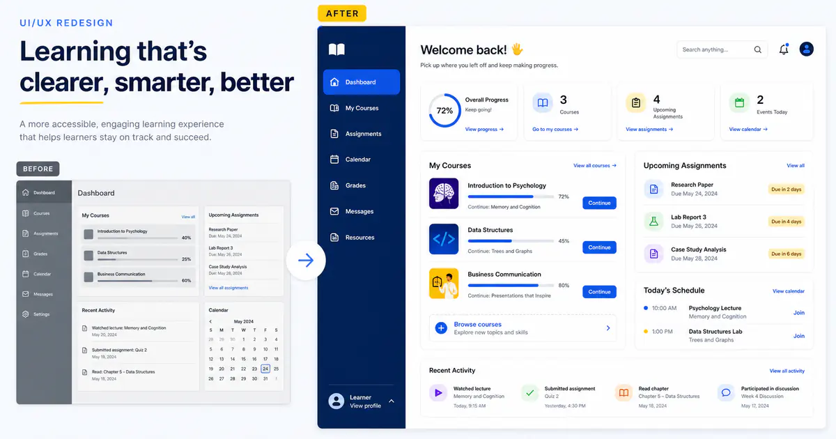
Project overview
An online learning product had accumulated navigation, dashboard widgets, and one-off interaction patterns as courses and assessment tools expanded. Students could complete their work, but usability interviews showed that many were unsure what to do next, where feedback lived, or which deadline mattered most. I led a research, design, and front-end redesign focused on clarity, accessibility, and repeatable UI foundations.
The engagement was not a visual reskin. It reconsidered information architecture, task flows, content hierarchy, component behavior, and responsive states, then implemented the new system in Next.js and TailwindCSS.
Problem statement
The dashboard gave every module equal visual weight. Course progress, assignments, messages, and calendar events competed for attention, while navigation labels reflected internal product terminology. Keyboard focus was inconsistent, several color combinations lacked sufficient contrast, and narrow layouts pushed essential actions below long secondary panels.
The team needed evidence about student priorities, a design that could ship incrementally, and components that would prevent accessibility regressions as the product evolved.
Research and design process
I reviewed analytics, support themes, and session recordings, then conducted moderated usability sessions with students using different devices and assistive technologies. A task inventory revealed three dominant intentions: continue the current lesson, understand upcoming work, and review feedback. The revised architecture placed those actions before secondary discovery and reporting.
Low-fidelity prototypes tested navigation language and dashboard hierarchy before visual styling. High-fidelity designs introduced a restrained color system, clearer type scale, consistent status patterns, and progressive disclosure for optional detail. Mobile layouts were designed around task priority instead of stacking the entire desktop page.
The TailwindCSS component layer used semantic variants rather than page-specific class combinations:
<ProgressCard
  title="Data Structures"
  value={45}
  action={{ label: "Continue lesson", href: "/learn/data-structures" }}
/>
Storybook documented states for empty data, loading, errors, long labels, keyboard focus, and reduced motion. Design tokens connected Figma decisions to CSS variables, allowing contrast and spacing improvements to propagate consistently.
Accessibility and validation
- Semantic landmarks and heading order supported efficient screen-reader navigation.
- Every interactive element received a visible keyboard focus state.
- Status changes used text and icons in addition to color.
- Form errors were associated with fields and summarized after submission.
- Motion respected
prefers-reduced-motionand avoided essential timed interactions. - Playwright and axe-core checks covered critical learner flows in continuous integration.
Usability sessions were repeated with the interactive implementation. Issues were recorded by severity, and the final release included analytics for continue-lesson, assignment-view, feedback-open, and navigation-success events.
Outcomes
Participants completed the three core tasks 46% faster in the final usability comparison. After rollout, weekly lesson completion increased by 19%, and support requests related to locating assignments or feedback decreased by 33%. Audited priority journeys met the targeted WCAG 2.2 AA criteria.
The component library reduced duplicate front-end patterns and gave product teams a shared vocabulary for future work. Because the redesign shipped route by route behind feature flags, the team could compare behavior and correct issues without a risky one-time migration.
Key design decisions
Progress was presented as context, not pressure. The interface showed the next useful action and recent learning rather than ranking students or using alarming colors for ordinary delays. Upcoming work distinguished a hard deadline from a suggested study date, which reduced ambiguity without making the dashboard louder. Course cards used meaningful titles and progress text that remained understandable when color or charts were unavailable.
The design system separated primitive tokens from semantic roles. Components referenced surface, text-muted, focus, and status-warning rather than isolated color values, so contrast changes could be made consistently. Native HTML behavior was preferred over custom widgets when it met the interaction need. Where a complex component was necessary, its keyboard model and screen-reader output were documented beside visual examples. This made accessibility a repeatable engineering constraint, not a final audit task delegated after implementation.
Related engineering work
The implementation principles are detailed in TailwindCSS best practices for scalable UI and the benefits of Next.js. For another product centered on complex workflows, explore the real-time collaboration platform case study.